The Psychology Behind Website Colors, and Why Yours Might Be Scaring People Away
You spent time choosing the perfect colors for your website. Maybe they match your brand, maybe they look modern. But here’s the problem—color isn’t just design, it’s psychology.
Your color choices might be unintentionally repelling users, creating stress, or even causing them to distrust your brand.
In this blog, you’ll learn how website colors impact behavior, what your current palette might be doing wrong, and how to choose colors that build trust, improve conversions, and feel right to your audience.
🎯 Why Color Psychology on Websites Matters
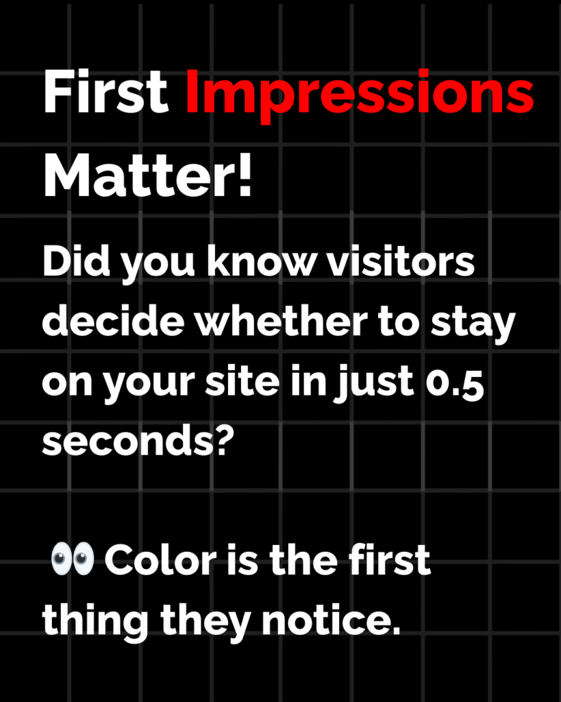
Colors affect how users feel, behave, and decide. Studies show that color influences up to 90% of first impressions. On a website, that first impression happens in under 3 seconds.
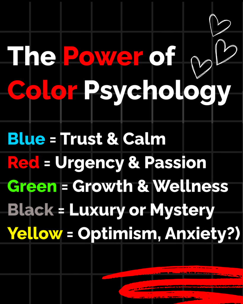
Red can increase urgency—but also aggression
Blue builds trust—but too much can feel cold
Green is calm and ethical—but can also blend in
Black is luxurious—but can feel intimidating
Choosing the wrong combination can overwhelm visitors, make CTAs invisible, or even lead to higher bounce rates.
🧠 What Your Website Colors Might Be Telling Visitors
1. Too Much White = Emotionless or Empty
Minimal design is trendy, but if your website uses too much white (or blank space), users may interpret it as cold, unfinished, or lacking substance.
Fix: Use soft accent tones to guide the eye and balance the layout. White space is good, but give it context.
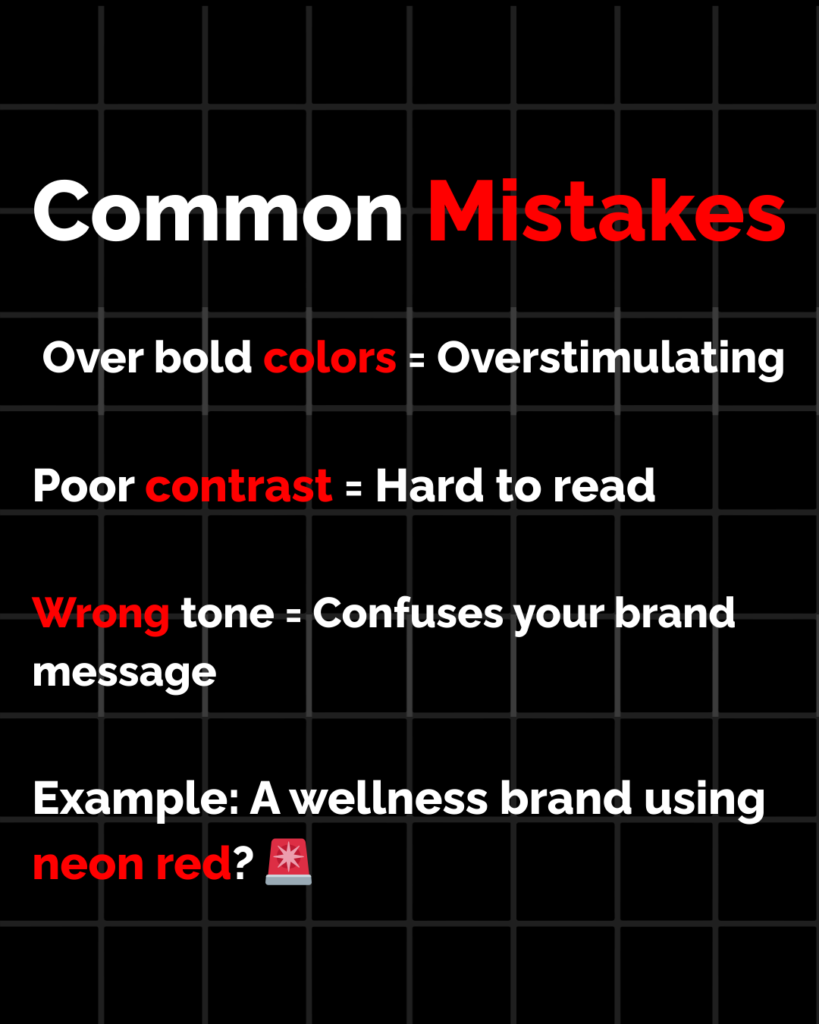
2. High-Contrast Colors = Stressful to Read
Bright red text on black, neon yellow buttons on white—these hurt the eyes. Poor contrast can make people leave fast, especially on mobile.
Fix: Use high contrast for legibility, not aesthetics. Stick with readable color combos like dark gray on light backgrounds, or bold accents for buttons only.
3. Wrong Color for Your Industry = Confusion
Imagine a finance site with orange and purple. Or a mental health site in all red. Misaligned colors can confuse users or make them question your credibility.
Fix: Use colors that align with industry expectations:
Blue, gray, green for finance and healthcare
Earth tones for wellness or sustainability
Bold reds or oranges for e-commerce urgency
Black and gold for luxury
4. Your CTA Buttons Blend In
If your “Book Now” or “Buy” button uses the same color as your background or text, users won’t even see it.
Fix: Use a contrast color for your CTA that grabs attention, and keep it consistent across the site.
5. Dark Mode Doesn’t Mean “Cool” for Everyone
Dark websites are trendy, but not all audiences like them. Older users often find them harder to read, and poor contrast can make content disappear.
Fix: Only use dark mode if it fits your brand and user base. Test it with real people—not just your design team.
🖼️ What Colors Actually Do to the Brain
Here’s a breakdown of common colors and the emotions they trigger:
| Color | Psychological Effect | Works Best For |
|---|---|---|
| Blue | Trust, calm, professionalism | Finance, tech, medical, SaaS |
| Red | Urgency, energy, passion | Sales, food, entertainment |
| Green | Health, nature, balance | Wellness, sustainability, non-profits |
| Yellow | Optimism, attention-grabbing | Travel, youth, promotions |
| Black | Sophistication, power, luxury | Fashion, premium services |
| Orange | Excitement, warmth, movement | Startups, sports, action-driven brands |
| Purple | Creativity, spirituality, luxury | Beauty, education, premium products |
Use this as a reference when designing landing pages, product pages, or rebranding.
🧪 How to Test and Fix Your Website Colors
Use heatmaps: See where people click or avoid clicking
A/B test button colors: Even small changes can double your CTR
Check accessibility: Use tools like WebAIM or Contrast Checker to ensure readability
Ask real users: Feedback reveals emotional reactions that analytics can’t
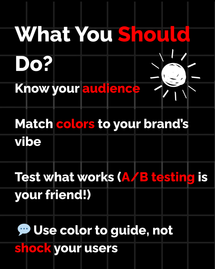
🧠 Bonus Tip: Use Color to Guide, Not Decorate
Colors should direct users toward action. Use neutral backgrounds, and make calls-to-action pop with bold, focused colors. Use color to build a journey, not just a vibe.
💬 Final Thoughts
Color is silent communication. If your website feels off, if people bounce fast, or your conversions are weak—your color palette might be the reason.
It’s not about what looks good. It’s about what feels right to your audience.
👉 Need help picking the perfect color system that increases trust and conversions? [Request a Website Color Psychology Review]